03 Authorship
Typography
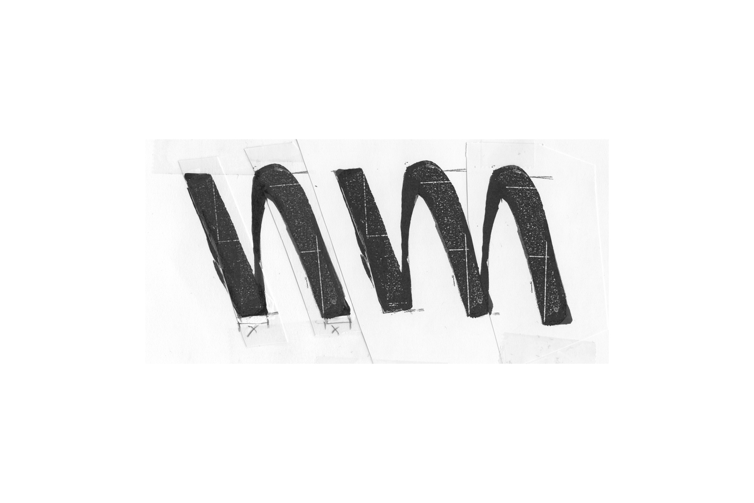
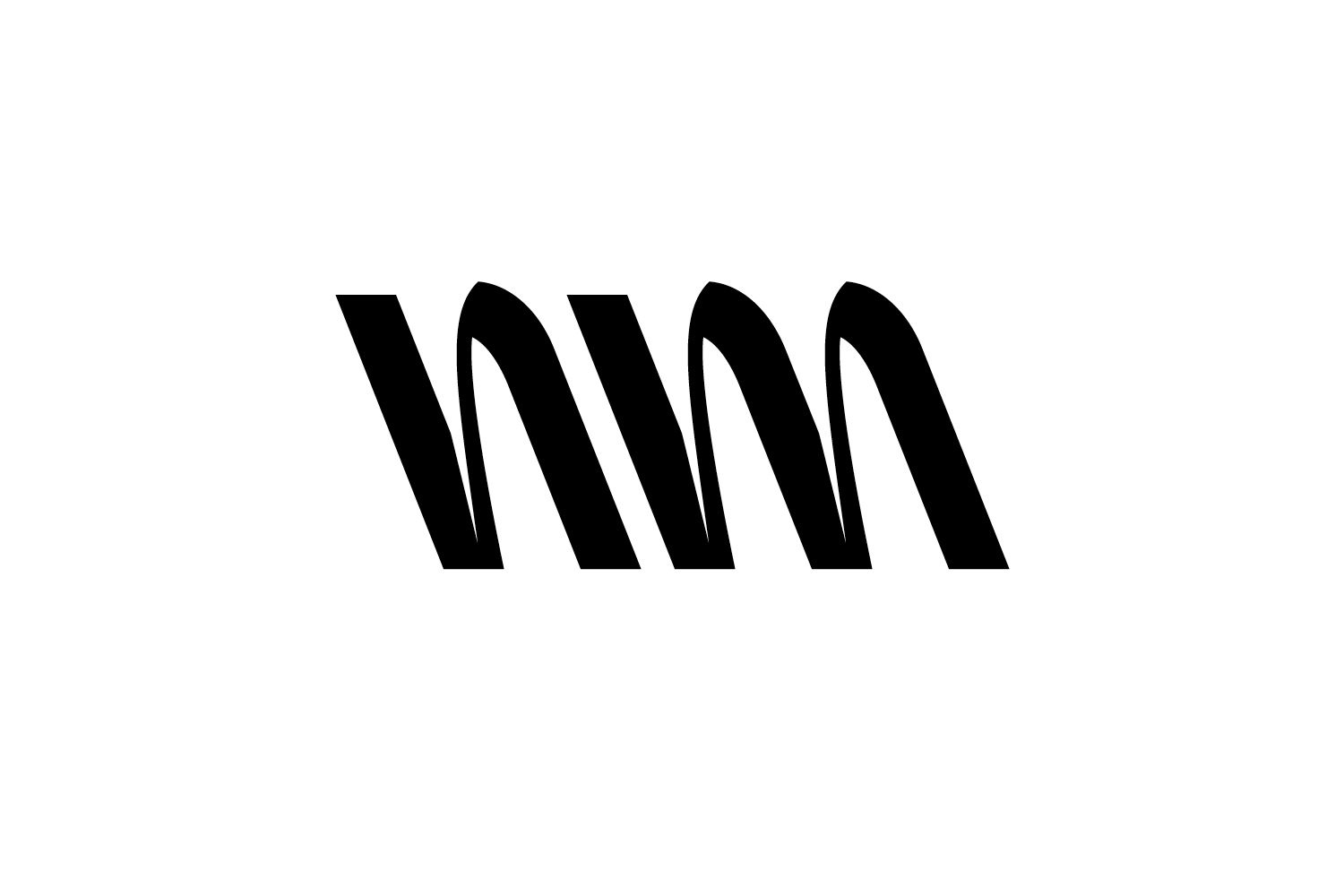
Coming from a rough idea for a typeface to a first sketch is already a big step, but once the letterforms start to shape, its delightful to watch.
Considering every detail requires patience and attention, but forms the backbone of a unique and strong typeface.
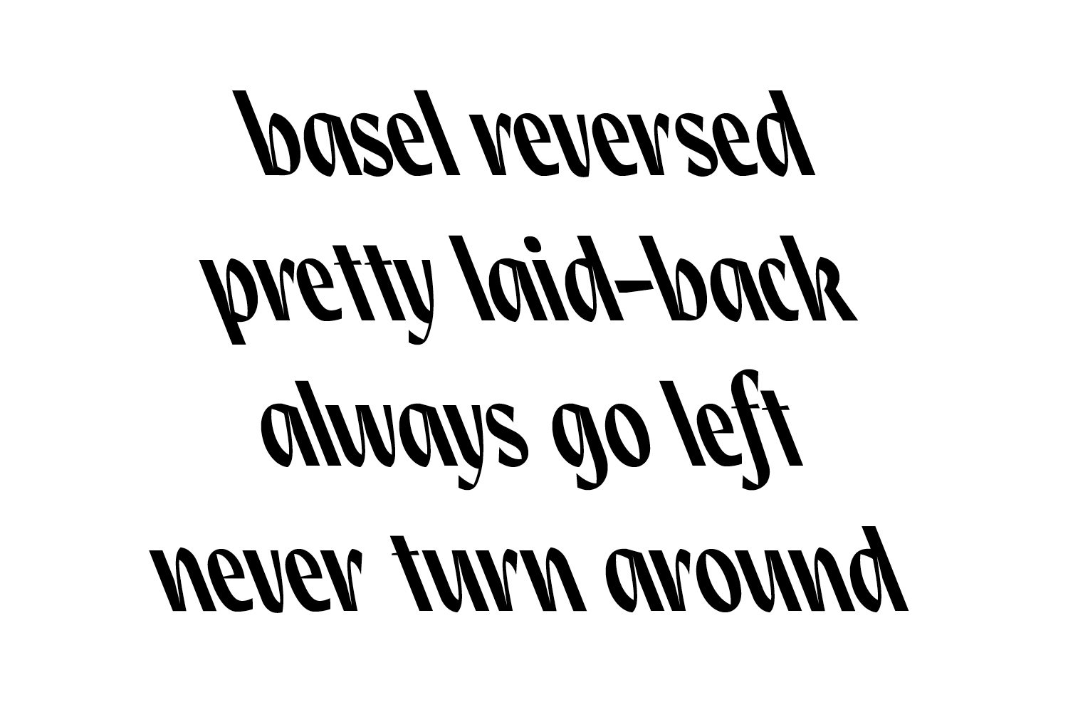
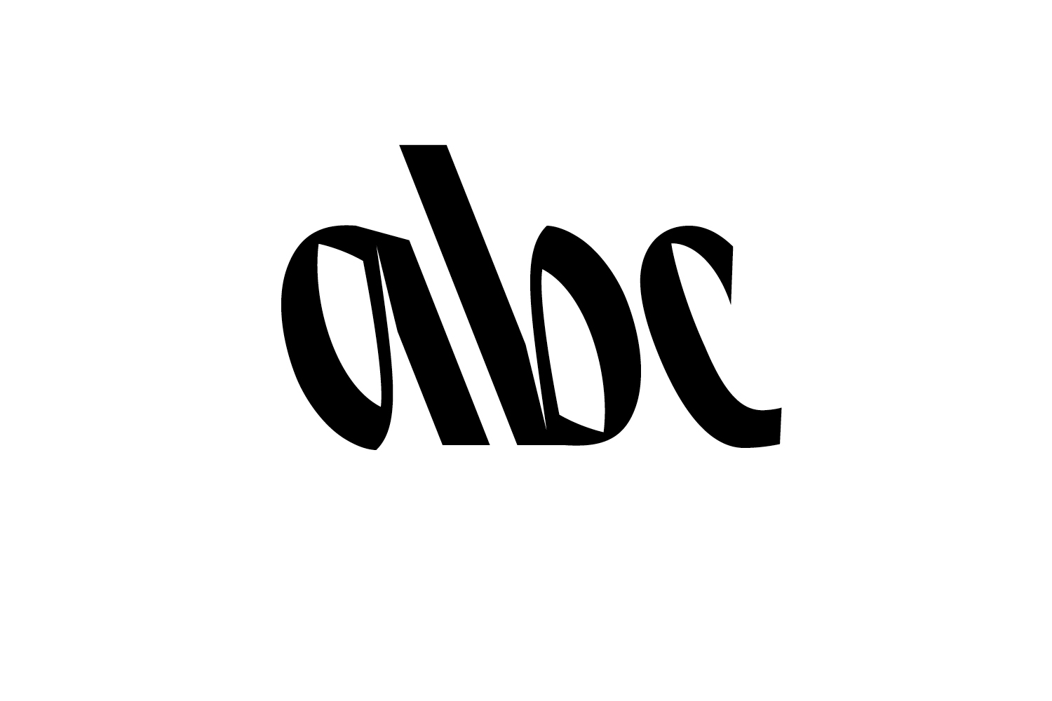
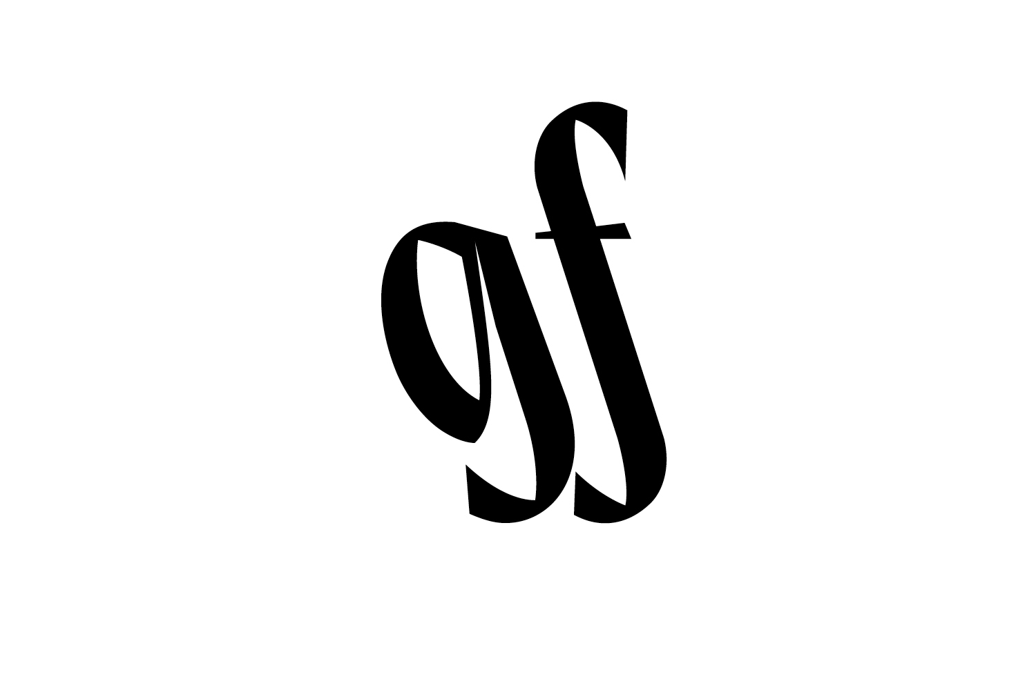
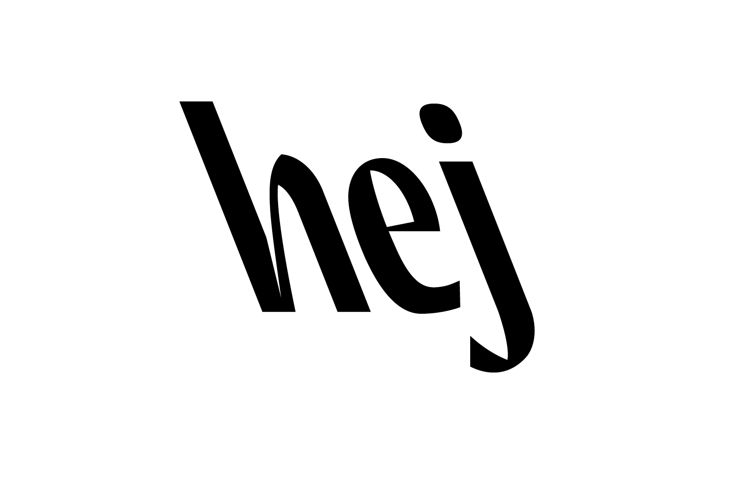
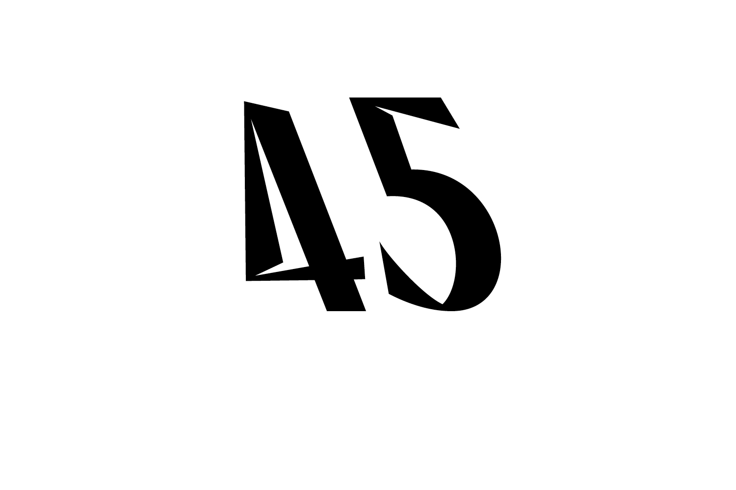
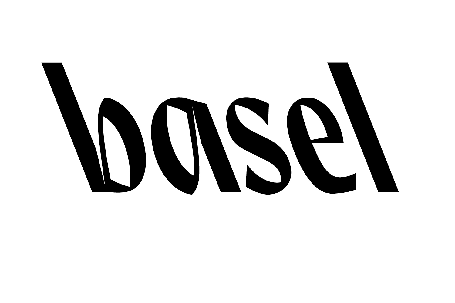
Project: basel reversed
By: Stephanie Müller
Year: 2019
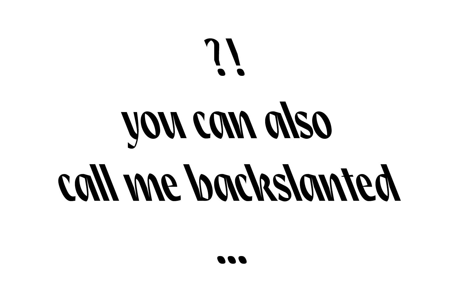
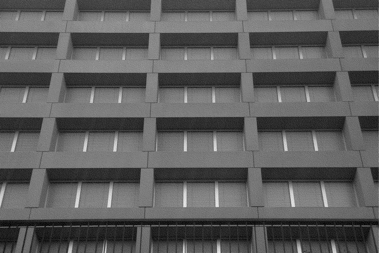
The font refers to my handwriting which is slightly left bend and rather uncommon. The letterforms are inspired by humanistic handwritten italics and combined with characteristics from the architecture in the industrial area of Basel.
The font exists only as display version in small letters to emphasise on their connection through a fluid handwriting gesture. It appears harsh and strict through stem thickness, blackness and the underlying grid which is set in an angle of 21,5°.
Mentored by Swiss Designer Matthias Pauwels
© Stephanie Müller 2019 hej @ stephiemueller . com legal notice
© Stephanie Müller, 2019
hej @ stephiemueller . com
legal notice